
The System Behind Subscription Cancellation

Most people do not remember signing up for their subscriptions.
It happens quickly. A few clicks. A confirmation email. The charge settles into the background and becomes part of the month.
Leaving is different.
Canceling rarely feels dramatic or openly hostile. It just feels heavier than it should. Heavy enough to interrupt the moment. Heavy enough to make you notice that something has changed.
Most explanations stop at the interface. They focus on buttons, screens, and design tricks. That perspective is understandable, but it does not explain why the same experience keeps showing up even after lawsuits, regulation, and public backlash.
When a pattern survives rule changes, it is rarely just a design decision. It is usually a system behaving exactly as it was built to behave.
This is not an argument about fairness. It is not advice on how to cancel faster. It is an attempt to explain why subscription cancellation feels the way it does at all.
What actually happens when you try to cancel
People do not usually cancel subscriptions in anger.
They are cleaning up expenses. They stopped using the service. Money feels tighter than it used to. The intent is practical and final.
You log in expecting closure.
Instead, the experience stretches out.
You may be asked why you are leaving. Sometimes you are reminded of features you barely remember using. Other times you are shown a cheaper plan or encouraged to pause instead of exiting.
Individually, none of these steps feels outrageous. Collectively, they change the nature of the action. Canceling stops being a decision and becomes a process.
That shift is not accidental. It is not primarily about polishing user experience. It is about pressure.
The explanation everyone reaches for
When people talk about cancellation friction, they usually reach for one explanation: dark patterns.
The term refers to design choices that steer users toward outcomes they might not choose if everything were clear. Hidden options. Confusing language. Extra steps that quietly discourage follow through.
Dark patterns are real. Regulators have documented them.
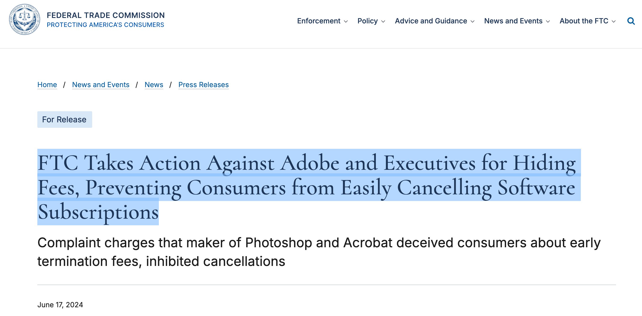
In one enforcement action, the Federal Trade Commission found that customers who signed up online were forced to cancel by phone, where retention agents were compensated based on save rate.
In another case, internal documents described a cancellation process deliberately designed to be long and disorienting. In a third, early termination fees were disclosed in ways that made them effectively invisible until customers tried to leave.
These are not hypotheticals. They are enforcement actions.
And yet, even after fines, settlements, and new rules, the cancellation experience still feels heavy.
That is the clue most explanations miss.
Dark patterns exist, but they are not the engine. They are a tactic.
Drawing the system boundary
To understand what is happening, the scope needs to be narrow.
This is not a moral debate about whether companies are ethical.
It is not a question of whether subscriptions should exist.
It is about one system only.
Subscription businesses managing churn volatility.
Once you stay inside that boundary, the behavior stops looking arbitrary.
Why churn creates a different kind of pressure
Churn simply means customers leaving. In subscription businesses, churn does not happen smoothly over time. It comes in waves.
After price increases.
After layoffs.
After holidays.
After free trials convert.
After major product changes.
Those waves matter because subscription businesses are valued on predictability as much as revenue. Investors and executives care deeply about how stable future cash flows appear. Metrics like Annual Recurring Revenue and Net Revenue Retention exist to measure that stability.
Research across the SaaS sector consistently shows that higher churn lowers valuation multiples. Even modest increases can materially change how a company is valued.
That is the pressure shaping cancellation behavior.
The system is not trying to prevent you from canceling forever. It is trying to manage how quickly cancellations resolve.
Time is the variable being controlled.
Why friction targets timing instead of consent
From a user’s perspective, cancellation is binary. You are in or you are out.
From the system’s perspective, cancellation has a timeline.
Did the cancellation happen before the billing cycle closed.
Did the customer accept a pause instead.
Did they downgrade rather than exit.
Did the delay trigger another charge.
Each outcome has a different financial impact. That is why cancellation flows are not a single button click. They are funnels. Exit funnels.
The goal is not persuasion in the abstract. It is timing control.
What incentives look like inside the system
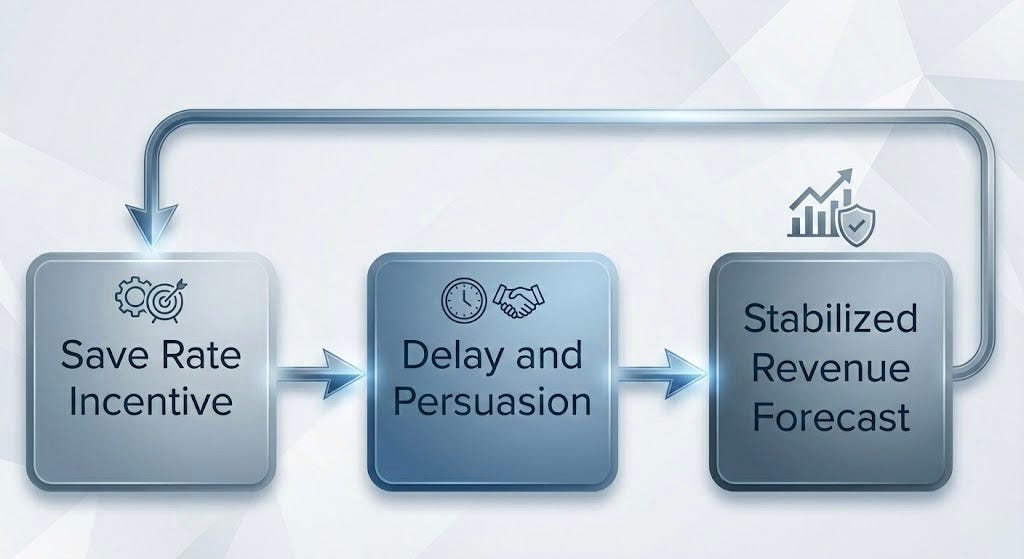
In the Vonage case, the FTC documented that retention agents were rewarded based on save rate.
Not customer satisfaction.
Not resolution speed.
Save rate.
That incentive does not require malicious intent. It simply rewards delay and persuasion.
Digital systems replicate the same logic without humans. Pause options exist because paused accounts do not count as churn. Downgrades preserve partial revenue. Targeted discounts matter because last minute reversals stabilize forecasts.
When dark patterns appear, they amplify these incentives. They are not separate from the system. They are how the system expresses pressure.
Regulation changes the shape, not the force
Regulators have intervened.
The FTC amended the Negative Option Rule to require cancellation to be as easy as signup. States such as California, New York, and Colorado require online cancellation when signup occurs online. Australia’s competition regulator has pursued actions against misleading cancellation practices.
These efforts remove the most abusive tactics. They do not remove the underlying pressure.
Instead, friction moves.
When phone only cancellation is banned, friction shifts online.
When hidden links are banned, friction moves into timing windows.
When undisclosed fees are banned, friction becomes procedural.
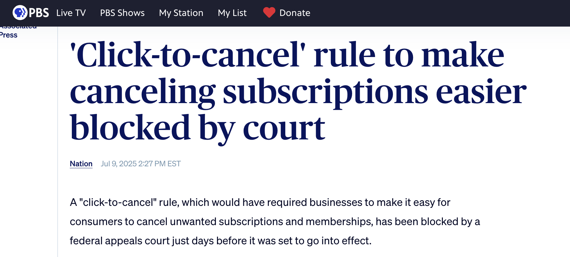
Even the FTC’s click to cancel initiative was challenged and blocked on procedural grounds. The system remains, and it adapts.
What friction migration actually looks like
Many people expect cancellation to become simple once rules exist.
Instead, it becomes technically compliant and experientially heavy.
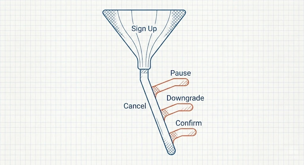
A pause option that delays churn.
A downgrade that requires more thought than exit.
A processing window that extends billing by one cycle.
A confirmation email that arrives late or ambiguously.
Each step is defensible in isolation. Together, they reshape behavior.
Why it feels personal
From the user’s side, this experience often feels disrespectful. From the system’s side, it feels necessary.
That tension is not resolved by better intentions. It is produced by structure.
No one has to wake up wanting to frustrate customers. The incentives do the work.
What cancellation actually is inside the business
Inside a subscription company, cancellation is not treated as a button click.
It is treated as a risk event. The moment future revenue becomes uncertain.
Volatility is what subscription businesses are built to avoid. A frustrated customer who keeps paying is predictable. A customer who might leave at any moment is not.
The system does not try to change your mind in the abstract. It tries to slow the moment when uncertainty becomes final.
The questions appear for a reason. Timing matters. Pauses, downgrades, and billing windows exist to slow the moment when uncertainty becomes final.
Seen this way, the behavior stops looking mysterious.
Most people experience subscription cancellation as a personal hassle. Inside the business, it is not designed for the person canceling. It is designed for the spreadsheet that comes after.
The process is inherently more difficult than the initial sign-up, which explains its procedural, rather than decisive, feeling. This also accounts for the common visual and structural similarities seen across vastly different companies.
You are not encountering bad design by accident. You are encountering a system that treats exits as financial disturbances and manages them accordingly.
Seeing cancellation this way does not make the experience better. It makes it legible.